Front-end/Material UI
MUI - Autocomplete
Cuvely
2024. 7. 10. 15:12
728x90
반응형
Autocomplete
Autocomplete란 사용자가 입력할 때마다 옵션을 제안해주는 기능이다.
자동으로 입력값이 포함된 옵션을 보여주면서 선택할 수 있게 해준다.
import { Autocomplete, TextField } from "@mui/material";

function Mui() {
    const top100Films = [ // 단어검색시 보여줄 옵션들을 나열한다.
        { label: 'The Shawshank Redemption', year: 1994 },
        { label: 'The Godfather', year: 1972 },
        { label: 'The Godfather: Part II', year: 1974 },
        { label: 'The Dark Knight', year: 2008 },
        { label: '12 Angry Men', year: 1957 },
        { label: "Schindler's List", year: 1993 },
        { label: 'Pulp Fiction', year: 1994 },
        { label: 'The Lord of the Rings: The Return of the King', year: 2003 },
        { label: 'The Good, the Bad and the Ugly', year: 1966 },
        { label: 'Fight Club', year: 1999 },
      ];
    return (
        <div>
            <Autocomplete // autocomplete 컴포넌트를 사용한다.
                disablePortal
                id="combo-box-demo"
                options={top100Films} // 위에서 정의한 옵션들을 불러온다.
                sx={{ width: 300 }}
                renderInput={(params) => <TextField {...params} label="Movie" />}
            />

        </div>
    );
}

export default Mui;
리액트에서 Autocomplete와 TextField 를 import 해서 사용한다.
Autocomplete 태그 속 속성들을 추가해 커스터마이징을 할 수 있다.
코드를 구현한 화면은 이러하다.
728x90
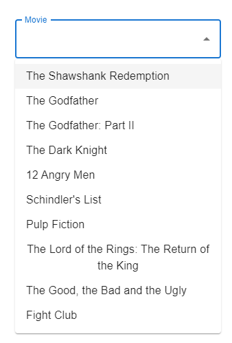
input 태그에 마우스를 클릭하면 옵션들을 보여준다.
단어를 입력하면 입력한단어가 포함된 옵션들만 보여준다.

입력한 단어가 없을경우 옵션에 없다고 나타내준다.

반응형
Autocomplete 옵션중 필요한 옵션들만 적어본다.
<Autocomplete
    disableClearable // X표시를 없애준다
    clearOnEscape // Escape 키를 눌렀을 때 입력 내용을 지워준다.
    readOnly // 수정할수 없게 읽기모드로 전환한다.
    clearOnBlur // 입력 필드가 포커스를 잃었을 때 입력 내용을 자동으로 지운다.
    		\   // 입력이 확정된 후에 불필요한 입력 내용을 제거할 수 있다.
    disablePortal
    id="combo-box-demo"
    options={top100Films}
    sx={{ width: 300 }}
    renderInput={(params) => <TextField {...params} label="Movie" />}
/>
그외 필요한 input 컴포넌트는 아래사이트에서 찾아 사용 할 수 있다.
https://mui.com/material-ui/react-autocomplete/
728x90
반응형